Design Principles - Week 10 - 14
26/10/2021 - 23/11/2021 (Week 10 - Week 14)
Reagan Val Adelbert Mahadi /
0349177
Design Principles / Bachelor of Design in Creative Media
Final
Project / Visual Analysis and Final Blog
LECTURES
On week 10, I watched M. Jinchi's pre-recorded lecture about Visual Analysis.
Visual Analysis
Visual analysis is a method of understanding design that focuses on the visual elements and principles. In its strictest definition - a description and explanation of visual structure for its own sake. The purpose of visual analysis can also be to recognize the choices that a designer made in creating the design, as well as to better understand how the formal properties of a design communicate ideas, content, or meaning.
Visual analysis is a critical part of visual literacy, a skill that helps people read and critically interpret images, whether in a museum, on social media, in entertainment, advertising, or the news. We are constantly confronted with visual media. Practicing visual analysis sharpens critical judgment skills and helps people seek out answers instead of passively receiving information.
How does visual analysis work?
Visual analysis can include
three phases:
- Observation
- Analysis
- Interpretation
Observation
Observation means closely looking at and identifying the visual elements of a design, trying to describe them carefully and accurately in your own words. Not reading beforehand about the design at all. The observation phase is about looking, thinking, and finding good language to communicate what we notice.
Analysis
Analysis requires you to think about your observations and try to make statements about the work based on the evidence of your observations. Think about how the specific visual elements that you've identified combine together to create a whole, and what effect that whole has on the viewer.
Interpretation
For interpretation, our observations, description, and analysis of the work are fused with facts about the design work (and in some cases the designer) and historical context that you find in trustworthy published sources.
INSTRUCTIONS
Final Project: Visual Analysis and Final Blog
For the first part of the project, we are told to select a design of our choice (poster/billboard/illustration/ etc). We are going to conduct a visual analysis of the design in about 500 words.
For our second part of the project, we will need to produce a work of design, in A4 or A3 size, inspired/influenced by the design we have analyzed, or as a reaction to it. We also have to write a 150-200 word rationale for our design.
Visual Analysis 1
 Fig. 1.1 SPIDER-MAN INTO THE SPIDER-VERSE movie poster
(https://www.ukposters.co.uk/posters/spider-man-into-the-spider-verse-fall-v50589)
Observation
The design work is in portrait format. For the visual elements, the main colors observed are red, black, white, and blue. The overall color is not so much. There is a movie title on the bottom part of the poster with black and white font color. In the middle part, there is an illustration of spiderman falling down. On the upper side of the poster, there are many buildings that act as the background.
Analysis
This poster design is asymmetrically balanced. The emphasis is on the central image (spiderman), which is making a pose of falling down from the sky to the city. The pose spiderman made is guiding the viewer's eyes, from his feet to the title and his arm that is guiding the viewers to the visuals that are located on the top side of the poster. The buildings represent harmony, where they have similar shapes, sizes, and also colors. Besides harmony, the buildings also represent repetition. There is unity in the overall composition of the poster. The black color of spiderman and the background also contains contrast between black which is a heavy color and light blue.
Feedback
I need to do some research because I want to know the background of the design when I write the interpretation. If I cant find the designer, when I write the interpretation I have to look at the meaning behind the work as well as relate it to actual movie posters. I need to choose carefully.
For observation, I have to put what does the poster contains. I have to describe the poster the way I see it. For example, there is an image of a character seemingly looking upwards with some image of buildings in the background that are shown upside down. Describe the whole poster.
For analysis, Ms. Jinchi said that the poster isn't asymmetrically balanced. Use capital S for Spiderman since it's a name. I need to mention the principle that is contained within the poster. I also need to add more descriptions for the principles contained in the poster.
Ms. Jinchi said that I have to do more research on what the purpose of the design is for phase 3.
Visual Analysis 2
I wanted to conduct another visual analysis of different illustrations that I find interesting, so I surfed Pinterest.
 Fig. 1.2 Illustration by Xuteng Pan
(https://www.artstation.com/artwork/GX6Rvd)
Analysis
Interpretation
This illustration is made in 2018 by Xuteng Pan. Xuteng Pan made the illustration by using MoI3D, Cinema 4D, and Octane Render. He used this software for modeling the buildings and adding texture to them.

Fig. 1.3 Xuteng Pan's illustration progress
 Fig. 1.4 Xuteng Pan's building modeling
Looking at the illustration (Fig. 2), the designer is making a cityscape
design where he is trying to create a futuristic city. From the
illustration, I have a feeling that he uses his city's cityscape (Beijing)
as a reference to help him create this illustration since there is a
Chinese brand in the center of the building. I feel like, this
illustration lets Xuteng Pan express his imagination and creativity where
it lets the viewers visualize on how a futuristic city looks like and
appreciate the overall environment design.
Feedback
On week 12, Ms. Jinchi gave us feedback for the visual analysis since we are supposed to do the interpretation part. I need to make some minor changes to the observation and analysis.
For my observation, I need to put the foreground, background because the work has depths. I need to use descriptive directions to indicate where the characters are and also the objects.
For analysis, the illustration is approximately symmetrically balanced. I need to change some words and add some descriptions to it more.
As for interpretation, Ms. Jinchi said it was well put and I don't need to make any changes to it.
The next thing I need to do now is to look at how the design inspires my own design and I have to describe how it leads to my own idea.
Final Visual Analysis
Observation
The design work is in landscape format. For the visual elements, the main colors observed are black, blue, red. The illustration is mainly filled with black colors thus making it not colorful. The illustration uses similar colors for the lights (blue and red). There are buildings that are located far away from the person in the middle that acts as a background, while the person in the middle acts as the foreground. In the background, there are lots of lights surrounding the buildings. The illustration shows a person looking at a view at night where there are many buildings with different light colors surrounding him/her. The person in the lower ground middle seems to be looking at the top of a building where he/she is focusing on the main building in the middle. The main building is highlighted by the blue lights near it.
Analysis
The poster design is approximately symmetrically balanced. The overall illustration is filled with buildings on both sides left and right, which makes it balanced. The emphasis is on the person that is located on the lower ground middle and the center building. There is harmony where the buildings have the same color and structure. The buildings also represent repetition where they almost have similar shapes that are located almost everywhere on the illustration. The buildings have very different colors with the lights creating contrast between dark and light colors. There is also contrast between the person and the blue lights in the center since the person is colored black. The person in the middle of the illustration creates movement where it leads the viewer's eyes from the person to the center building. From the central building, there is a symbol that says "iQOO" which is a Chinese smartphone brand and manufacturer. Overall this illustration gives the feeling of a sense of place, where it shows a city view at night from the top of a building.
Interpretation
This illustration is made in 2018 by Xuteng Pan. Xuteng Pan made the illustration by using MoI3D, Cinema 4D, and Octane Render. He used this software for modeling the buildings and adding texture to them.
Xuteng Pan's work is mainly focused on concept art, 3D modeling, and illustration. His arts are mostly futuristic-themed, where there are many elements that represent it. His cityscape design reminds me strongly of the sense of place.
Looking at the illustration (Fig. 2), the designer is making a cityscape design where he is trying to create a futuristic city. From the illustration, I have a feeling that he uses his city's cityscape (Beijing) as a reference to help him create this illustration since there is a Chinese brand in the center of the building. I feel like, this illustration lets Xuteng Pan express his imagination and creativity where it lets the viewers visualize on how a futuristic city looks like and appreciate the overall environment design.
Overall, the illustration that I picked inspires me to create a design that expresses the environment, also brings a strong sense of place.
Visual Research

Fig. 2.2 Canyon's Port Town by Yoshinori Somei

Fig. 2.4 Illustration by Filipe Andrade
(https://www.deviantart.com/brandnewnostalgia/art/CYBERPUNK-with-Filipe-312739068)

Fig. 3.1 Sketch
For my sketch, I made a person doing parkour from a tall building to a smaller building. I made 3 sketches of the person to indicate the movement he did start from the tall building to the smaller building. I also added buildings in the background to describe the environment that is currently located in a city. I also added a road so that the city can look busier.
Ms. Jinchi gave me another feedback for my work, she said that it is way better now. I decided to pick the second sketch for my final design. She suggested I add the moon on the second sketch at the back of the person that is in mid-air so that the glow is in the center and add lighting to the buildings. Make sure to add another glow for the two other people so that they are visible.
So I proceeded with the second sketch and continue to digitize it.

Fig. 3.6 Digitization progress
Fig. 3.8 Final visual analysis design - PDF
My design expresses the environment where there is a person that is doing parkour in a city. I showed three people on my design so that movement is created where the person is jumping from the higher building to the lower building. I also added the moon behind the middle person so that contrast is shown and the main focus will be the middle person. Overall, this design shows a strong sense of place.
REFLECTIONS
This project was that took the most time for me. I had to do a lot of things for this project like the visual analysis. The visual analysis took me some time to do because I had trouble doing it the first time. When I was in class getting feedback from Ms. Jinchi I get to understand more about what I need to write on visual analysis. As for the design I made, I didn't think that I will make a design that is similar to my previous project which is a sense of place. Even though I may have created a similar design concept with the previous one I still had some fun doing this project.
Observation means closely looking at and identifying the visual elements of a design, trying to describe them carefully and accurately in your own words. Not reading beforehand about the design at all. The observation phase is about looking, thinking, and finding good language to communicate what we notice.
Analysis
Analysis requires you to think about your observations and try to make statements about the work based on the evidence of your observations. Think about how the specific visual elements that you've identified combine together to create a whole, and what effect that whole has on the viewer.
Interpretation
For interpretation, our observations, description, and analysis of the work are fused with facts about the design work (and in some cases the designer) and historical context that you find in trustworthy published sources.
INSTRUCTIONS
Final Project: Visual Analysis and Final Blog
For the first part of the project, we are told to select a design of our choice (poster/billboard/illustration/ etc). We are going to conduct a visual analysis of the design in about 500 words.
For our second part of the project, we will need to produce a work of design, in A4 or A3 size, inspired/influenced by the design we have analyzed, or as a reaction to it. We also have to write a 150-200 word rationale for our design.
Visual Analysis 1
(https://www.ukposters.co.uk/posters/spider-man-into-the-spider-verse-fall-v50589)
Observation
The design work is in portrait format. For the visual elements, the main colors observed are red, black, white, and blue. The overall color is not so much. There is a movie title on the bottom part of the poster with black and white font color. In the middle part, there is an illustration of spiderman falling down. On the upper side of the poster, there are many buildings that act as the background.
Analysis
This poster design is asymmetrically balanced. The emphasis is on the central image (spiderman), which is making a pose of falling down from the sky to the city. The pose spiderman made is guiding the viewer's eyes, from his feet to the title and his arm that is guiding the viewers to the visuals that are located on the top side of the poster. The buildings represent harmony, where they have similar shapes, sizes, and also colors. Besides harmony, the buildings also represent repetition. There is unity in the overall composition of the poster. The black color of spiderman and the background also contains contrast between black which is a heavy color and light blue.
Feedback
I need to do some research because I want to know the background of the design when I write the interpretation. If I cant find the designer, when I write the interpretation I have to look at the meaning behind the work as well as relate it to actual movie posters. I need to choose carefully.
For observation, I have to put what does the poster contains. I have to describe the poster the way I see it. For example, there is an image of a character seemingly looking upwards with some image of buildings in the background that are shown upside down. Describe the whole poster.
For analysis, Ms. Jinchi said that the poster isn't asymmetrically balanced. Use capital S for Spiderman since it's a name. I need to mention the principle that is contained within the poster. I also need to add more descriptions for the principles contained in the poster.
Ms. Jinchi said that I have to do more research on what the purpose of the design is for phase 3.
Visual Analysis 2
I wanted to conduct another visual analysis of different illustrations that I find interesting, so I surfed Pinterest.
(https://www.artstation.com/artwork/GX6Rvd)
Observation
The design work is in landscape format. For the visual elements, the main colors observed are black, blue, red. The illustration is mainly filled with black colors thus making it not colorful. The illustration uses similar colors for the lights (blue and red). The illustration shows a person looking at a view at night where there are many buildings with different light colors surrounding him/her. The person seems to be looking at the top of a building where he/she is focusing on the main building in the middle. The main building is highlighted by the blue lights near it.
The design work is in landscape format. For the visual elements, the main colors observed are black, blue, red. The illustration is mainly filled with black colors thus making it not colorful. The illustration uses similar colors for the lights (blue and red). The illustration shows a person looking at a view at night where there are many buildings with different light colors surrounding him/her. The person seems to be looking at the top of a building where he/she is focusing on the main building in the middle. The main building is highlighted by the blue lights near it.
Analysis
The poster design is symmetrically balanced. The overall illustration is
filled with buildings from left to right, which makes it balanced. The
emphasis is on the person and the center building. The buildings represent
harmony where the buildings have the same color and structure. The
buildings also represent repetition where they almost have similar shapes
that are located almost everywhere on the illustration. The buildings have
very different colors with the lights which represent contrast between
dark and light colors. There is also contrast between the person and the
blue lights in the center. The person in the middle of the illustration
creates movement where it leads the viewer's eyes from the person to the
center building. From the central building, there is a symbol that says
"iQOO" which is a Chinese smartphone brand and manufacturer. Overall this
illustration gives the feeling of a sense of place, where it shows a city
view at night from the top of a building.
Interpretation
This illustration is made in 2018 by Xuteng Pan. Xuteng Pan made the illustration by using MoI3D, Cinema 4D, and Octane Render. He used this software for modeling the buildings and adding texture to them.
Fig. 1.3 Xuteng Pan's illustration progress
Xuteng Pan's work is mainly focused on concept art, 3D modeling, and
illustration. His arts are mostly futuristic-themed, where there are
many elements that represent it. His cityscape design reminds me
strongly of the sense of place.

Fig. 1.5 Illustration by Xuteng Pan

Fig. 1.6 Tokyo Future City by Xuteng Pan
Fig. 1.5 Illustration by Xuteng Pan
Fig. 1.6 Tokyo Future City by Xuteng Pan
Feedback
On week 12, Ms. Jinchi gave us feedback for the visual analysis since we are supposed to do the interpretation part. I need to make some minor changes to the observation and analysis.
For my observation, I need to put the foreground, background because the work has depths. I need to use descriptive directions to indicate where the characters are and also the objects.
For analysis, the illustration is approximately symmetrically balanced. I need to change some words and add some descriptions to it more.
As for interpretation, Ms. Jinchi said it was well put and I don't need to make any changes to it.
The next thing I need to do now is to look at how the design inspires my own design and I have to describe how it leads to my own idea.
Final Visual Analysis
Observation
The design work is in landscape format. For the visual elements, the main colors observed are black, blue, red. The illustration is mainly filled with black colors thus making it not colorful. The illustration uses similar colors for the lights (blue and red). There are buildings that are located far away from the person in the middle that acts as a background, while the person in the middle acts as the foreground. In the background, there are lots of lights surrounding the buildings. The illustration shows a person looking at a view at night where there are many buildings with different light colors surrounding him/her. The person in the lower ground middle seems to be looking at the top of a building where he/she is focusing on the main building in the middle. The main building is highlighted by the blue lights near it.
Analysis
The poster design is approximately symmetrically balanced. The overall illustration is filled with buildings on both sides left and right, which makes it balanced. The emphasis is on the person that is located on the lower ground middle and the center building. There is harmony where the buildings have the same color and structure. The buildings also represent repetition where they almost have similar shapes that are located almost everywhere on the illustration. The buildings have very different colors with the lights creating contrast between dark and light colors. There is also contrast between the person and the blue lights in the center since the person is colored black. The person in the middle of the illustration creates movement where it leads the viewer's eyes from the person to the center building. From the central building, there is a symbol that says "iQOO" which is a Chinese smartphone brand and manufacturer. Overall this illustration gives the feeling of a sense of place, where it shows a city view at night from the top of a building.
Interpretation
This illustration is made in 2018 by Xuteng Pan. Xuteng Pan made the illustration by using MoI3D, Cinema 4D, and Octane Render. He used this software for modeling the buildings and adding texture to them.
Xuteng Pan's work is mainly focused on concept art, 3D modeling, and illustration. His arts are mostly futuristic-themed, where there are many elements that represent it. His cityscape design reminds me strongly of the sense of place.
Looking at the illustration (Fig. 2), the designer is making a cityscape design where he is trying to create a futuristic city. From the illustration, I have a feeling that he uses his city's cityscape (Beijing) as a reference to help him create this illustration since there is a Chinese brand in the center of the building. I feel like, this illustration lets Xuteng Pan express his imagination and creativity where it lets the viewers visualize on how a futuristic city looks like and appreciate the overall environment design.
Overall, the illustration that I picked inspires me to create a design that expresses the environment, also brings a strong sense of place.
Visual Research

Fig. 2.2 Canyon's Port Town by Yoshinori Somei
(https://id.pinterest.com/pin/8514686786015456/)

Fig. 2.3 Cyberpunk city book cover by Ignacio Bazan-Lazcano
(https://www.artstation.com/artwork/XnNKdR)
Fig. 2.3 Cyberpunk city book cover by Ignacio Bazan-Lazcano
Fig. 2.4 Illustration by Filipe Andrade
(https://www.deviantart.com/brandnewnostalgia/art/CYBERPUNK-with-Filipe-312739068)
Idea Exploration and Description
I want to create a sketch similar to Illustrations where it expresses the environment around it.
I want to create a sketch similar to Illustrations where it expresses the environment around it.
Fig. 3.1 Sketch
My sketch shows a person jumping from a building to another building. I
tried to express the environment where there is a road, buildings, and
people walking down the alleyway.
Feedback
On week 13, Ms. Jinchi gave feedback to my sketch and she said that my sketch can be an exciting work where I can show the movement of the person jumping, and also show the height of the buildings. it can be a good contrast piece. Try to make a busy cityscape by having a little bit up and down for the buildings. At this point, she said that she can't see from where the person is jumping, so I have to show the leap and make the size bigger. Try to make the jump from a lower point to a higher point, rather than skipping in the midair. I may want to do some research on parkour and study the movement to make the work a little bit closer to what you want to show. For the cityscape, I can learn from the visual research that I have done from different visuals that I collected.
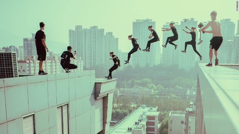
Before I made the sketch, I did some research on parkour movements. I looked up their movements from a video and from pictures.
I made another sketch for this task and try to make it by following the feedback I got from Ms. Jinchi.

Fig. 3.5 Second sketch
Feedback
On week 13, Ms. Jinchi gave feedback to my sketch and she said that my sketch can be an exciting work where I can show the movement of the person jumping, and also show the height of the buildings. it can be a good contrast piece. Try to make a busy cityscape by having a little bit up and down for the buildings. At this point, she said that she can't see from where the person is jumping, so I have to show the leap and make the size bigger. Try to make the jump from a lower point to a higher point, rather than skipping in the midair. I may want to do some research on parkour and study the movement to make the work a little bit closer to what you want to show. For the cityscape, I can learn from the visual research that I have done from different visuals that I collected.
Before I made the sketch, I did some research on parkour movements. I looked up their movements from a video and from pictures.


I made another sketch for this task and try to make it by following the feedback I got from Ms. Jinchi.
Fig. 3.5 Second sketch
For my sketch, I made a person doing parkour from a tall building to a smaller building. I made 3 sketches of the person to indicate the movement he did start from the tall building to the smaller building. I also added buildings in the background to describe the environment that is currently located in a city. I also added a road so that the city can look busier.
Ms. Jinchi gave me another feedback for my work, she said that it is way better now. I decided to pick the second sketch for my final design. She suggested I add the moon on the second sketch at the back of the person that is in mid-air so that the glow is in the center and add lighting to the buildings. Make sure to add another glow for the two other people so that they are visible.
So I proceeded with the second sketch and continue to digitize it.
Fig. 3.6 Digitization progress
I added the moon at the back of the middle person and added light at the
top person so that it can be visible while maintaining the focus on the
middle person.
Final Outcome
Final Outcome
Fig. 3.8 Final visual analysis design - PDF
My design expresses the environment where there is a person that is doing parkour in a city. I showed three people on my design so that movement is created where the person is jumping from the higher building to the lower building. I also added the moon behind the middle person so that contrast is shown and the main focus will be the middle person. Overall, this design shows a strong sense of place.
REFLECTIONS
This project was that took the most time for me. I had to do a lot of things for this project like the visual analysis. The visual analysis took me some time to do because I had trouble doing it the first time. When I was in class getting feedback from Ms. Jinchi I get to understand more about what I need to write on visual analysis. As for the design I made, I didn't think that I will make a design that is similar to my previous project which is a sense of place. Even though I may have created a similar design concept with the previous one I still had some fun doing this project.


/stickers-side-view-of-parkour-jump.jpg.jpg)
Comments
Post a Comment