Typography / Task 2: Typographic Exploration and Communication
22/09/2021 - 06/10/2021 (Week 5 - Week 7)
Reagan Val Adelbert Mahadi / 0349177
Typography / Bachelor of Design in Creative Media
Task 2 / Typographic Exploration and Communication (Text Formatting and Expression)
LECTURES
All lectures from week 1-5 can be found here: Typography / Task 1: Exercises (reaganmahadi.blogspot.com)
Week 5
During this week, Mr. Vinod checked on our first task's e-portfolio. While he was checking our e-portfolios, we were told to watch a tutorial for our second task typographic exploration and communication.
Week 6
In the sixth week, Mr. Vinod and Mr. Charles asked us to answer how we are feeling after the past six weeks. Another question is whether is there anything we would like Mr. Vinod to change? After the session is finished, we then proceed to the feedback session. Mr. Vinod gave feedback to some of my peers and then the ones that are already given feedback by Mr. Vinod will give feedback to the rest of my peers. Not long after that, everyone has gotten their feedback to finalize it for the submission.
INSTRUCTIONS
Task 2: Typographic Exploration and Communication
For this task, we were given 3 sets of texts that we need to choose 1 out of 3 sets of texts for our second task. We need to use InDesign software to do this task. I will be picking the second paragraph from three options.
Layout Research
I surfed through the internet to find some layouts that I think are nice.


Fig. 2.2 Text layout research

Fig. 2.3 Text layout research
Sketches
I made sketches for the title design.

I started digitising the sketches on Illustrator.

I made some changes to the body text by using InDesign.

Fig. 3.1 Layout progress (22/09/2021)
For my paragraphs, I used Univers LT Std 55 Roman with 9 points for the text point size. The leading point and the paragraph spacing will be 11 points. I used left alignment for the whole text paragraphs. I also removed hyphens in my text paragraph.
I used kernings for my paragraph to create smoother raggings and also to avoid widows and orphans. I also applied cross alignment by applying the baseline grid to help me out with it.

Fig. 3.2 Layout progress (22/09/2021)
Then I proceed on adding the title design to InDesign and create the
layouts.
 Fig. 3.3 First layout (29/09/2021)
For my second and third layouts, I used the same typeface and size for my texts. I also applied kerning to the texts.
 Fig. 3.4 Second layout (29/09/2021)
 Fig. 3.5 Third layout (29/09/2021)
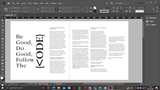
After receiving feedback from Mr. Vinod, I decided to choose the first layout and create changes to it so that the layout can look better.

I created some expressions for the headline for the word 'code'. I used the less than symbol (<) to replace the letter c and added curly brackets. I also keep the same typeface for the 'ode' word. I enlarged the 'Be Good, Do Good, Follow The' words and changed the leading to two points larger than the font size. I also decided to not use the line below the word code.

FEEDBACK
Week 6
General Feedback: Create an expression for the headline first then create the layout.
Specific Feedback: The first picture has a good layout, good balance, and rhythm in the layout, but lacks ideas in the headline expression. Need to fix the widow issues and ragging issues. Keep the same typeface for the word 'code' in the headline. The second picture shows a little bit of expression but that it is an external number that is placed into the headline. The word 'be good, do good, follow the' doesn't physically/visually suit link to the word 'code', and they are not in the grid system. Mr. Vinod said that the first layout is better in terms of layout but needs to work out the headline expression's idea.
Week 7
Specific Feedback: Good idea expression, good formatting of text.
Reagan Val Adelbert Mahadi / 0349177
Typography / Bachelor of Design in Creative Media
Task 2 / Typographic Exploration and Communication (Text Formatting and Expression)
LECTURES
All lectures from week 1-5 can be found here: Typography / Task 1: Exercises (reaganmahadi.blogspot.com)
Week 5
During this week, Mr. Vinod checked on our first task's e-portfolio. While he was checking our e-portfolios, we were told to watch a tutorial for our second task typographic exploration and communication.
Fig. 1.1 Video tutorial for task 2
Week 6
In the sixth week, Mr. Vinod and Mr. Charles asked us to answer how we are feeling after the past six weeks. Another question is whether is there anything we would like Mr. Vinod to change? After the session is finished, we then proceed to the feedback session. Mr. Vinod gave feedback to some of my peers and then the ones that are already given feedback by Mr. Vinod will give feedback to the rest of my peers. Not long after that, everyone has gotten their feedback to finalize it for the submission.
INSTRUCTIONS
Task 2: Typographic Exploration and Communication
For this task, we were given 3 sets of texts that we need to choose 1 out of 3 sets of texts for our second task. We need to use InDesign software to do this task. I will be picking the second paragraph from three options.
Layout Research
I surfed through the internet to find some layouts that I think are nice.
Fig. 2.1 Text layout research
Fig. 2.2 Text layout research
Fig. 2.3 Text layout research
Sketches
I made sketches for the title design.
Fig. 3.1 Title sketches (28/09/2021)
I started digitising the sketches on Illustrator.
Fig. 3.2 Title Digitisation (28/09/2021)
I made some changes to the body text by using InDesign.
Fig. 3.1 Layout progress (22/09/2021)
For my paragraphs, I used Univers LT Std 55 Roman with 9 points for the text point size. The leading point and the paragraph spacing will be 11 points. I used left alignment for the whole text paragraphs. I also removed hyphens in my text paragraph.
I used kernings for my paragraph to create smoother raggings and also to avoid widows and orphans. I also applied cross alignment by applying the baseline grid to help me out with it.
Fig. 3.2 Layout progress (22/09/2021)
For my second and third layouts, I used the same typeface and size for my texts. I also applied kerning to the texts.
After receiving feedback from Mr. Vinod, I decided to choose the first layout and create changes to it so that the layout can look better.
Fig. 3.6 Headline expression idea (05/10/2021)
I created some expressions for the headline for the word 'code'. I used the less than symbol (<) to replace the letter c and added curly brackets. I also keep the same typeface for the 'ode' word. I enlarged the 'Be Good, Do Good, Follow The' words and changed the leading to two points larger than the font size. I also decided to not use the line below the word code.
Fig. 3.7 New headline in layout (05/10/2021)
For the text paragraphs, I will fix the ragging issue and avoid any widows
and orphans.
Fig. 3.8 Fixing ragging and widow/orphans issue (05/10/2021)

Final Typographic Exploration and Communication

Fig. 3.9 Layout blocked (05/10/2021)
Final Typographic Exploration and Communication
Fig. 3.10 Final Typographic Exploration and Communication - JPEG
(05/10/2021)
Fig. 3.11 Final Typographic Exploration and Communication - PDF
(05/10/2021)
FEEDBACK
Week 6
General Feedback: Create an expression for the headline first then create the layout.
Specific Feedback: The first picture has a good layout, good balance, and rhythm in the layout, but lacks ideas in the headline expression. Need to fix the widow issues and ragging issues. Keep the same typeface for the word 'code' in the headline. The second picture shows a little bit of expression but that it is an external number that is placed into the headline. The word 'be good, do good, follow the' doesn't physically/visually suit link to the word 'code', and they are not in the grid system. Mr. Vinod said that the first layout is better in terms of layout but needs to work out the headline expression's idea.
Week 7
Specific Feedback: Good idea expression, good formatting of text.
REFLECTIONS
Experience
I never really made something like this, so this is the first time for me to do this. I was able to follow the instructions clearly and smoothly. I had some time to think of the layout for this task and finally, I was able to come up with the idea.
Observations
While I applied the cross alignment to the text paragraphs, I find it really satisfying with the paragraphs being one line with each other. I think that this detail is very crucial when making a task like this.
Findings
I found out that, there are a lot of details we need to pay attention to
when creating a work like this task. Even small mistakes in the work can
cause severe damage to it can cause problems for the reader to read
it
FURTHER READING

Fig. 4.1 Typographic design: FORM AND COMMUNICATION

Fig. 4.2 Anatomy of typography
FURTHER READING
Fig. 4.1 Typographic design: FORM AND COMMUNICATION
Fig. 4.2 Anatomy of typography
This page shows the readers the anatomy of typography. I decided to
read this page because I was having trouble remembering the anatomy
of typography.

Fig. 4.3 Anatomy of typography
Fig. 4.3 Anatomy of typography
Other than that, I also read a topic about typographic grid

Fig. 4.4 Typographic grid
Learned some tips when working with multicolumn grids from this book.
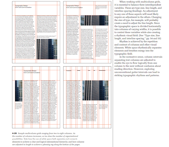
Fig. 4.5 Typographic grid
Fig. 4.4 Typographic grid
Learned some tips when working with multicolumn grids from this book.
Fig. 4.5 Typographic grid


Comments
Post a Comment