Typography / Task 3A: Type Design and Communication
06/10/2021 - 27/10/2021 (Week 7 - Week 10)
Reagan Val Adelbert Mahadi / 0349177
Typography / Bachelor of Design in Creative Media
Task 3A / Type Design and Communication
LECTURES
All lectures from week 1-5 can be found here: Typography / Task 1: Exercises (reaganmahadi.blogspot.com)
Week 7
For our seventh week in this module, we proceed to the next task which is type design and communication. This week, Mr. Vinod and Mr. Charles are gonna check on our task 2 e-portfolio, meanwhile, we are going to be watching some videos Mr. Vinod provided to us for task 3A.
From the video, we were reviewing the anatomy of typography.
 Fig. 1.1 Anatomy of typography
Mr. Vinod also mentioned overshoot.
Week 8
Week 8 is independent learning week so I came to class just to get feedback from Mr. Vinod regarding my type design sketches.
Week 9
On week 9, Mr. Vinod asked us to post our work on Facebook to receive some feedback from him. After all of us got feedback from Mr. Vinod, we can already leave the class.

Digitization
 Fig. 4.2 Digitization process (19/10/2021)

Fig. 4.10 Final Task 3A: Type Desing and Communication "Tektonick Regular" - PDF (26/10/2021)
Fig 4.11 "Tektonick Regular" A4 Poster - PDF (02/10/2021)
FEEDBACK
Week 7
General Feedback: Read and do research before beginning on watching the video, and understand the anatomy of typography. Consistency is key to having a good e-portfolio
Week 8
Specific Feedback: The type design on the third left is excellent and requested me to proceed with that type design. He mentioned that he has seen similar-looking type designs like that but they might not be exactly the same and my type design is cool-looking.
Week 9
General Feedback: The type design must be consistent and clear.
Specific Feedback: Mr. Vinod said that my typeface is good, interesting, and consistent. He suggested I make some changes to some of the alphabets. He also suggested I add some flairs to my type design.
Week 10
Specific Feedback: An interesting typeface, consistent in look and feel. Stranglely seems to look like it has an inconsistent meanline, but it actually is constant. The font is good, but the poster needs to remove the graphical elements that over shadow the font. The star is the font and it should dominate the space (using the same point size.
REFLECTIONS
Experience
Overall, I really enjoy designing a typeface. It took me quite a while to create the sketches but eventually, I ended up making 5. It was quite a fun experience to create a font of my own design I really enjoy this task compared to others.
Observations
This task requires us to research more about the anatomy of typography. I observed that there are so many things that we need to know before creating a design of our own.
Findings
When I was creating my design on Illustrator, it was really important to loop up at the little details. Even if I make a small mistake, it can affect the whole design and makes it look not consistent.
FURTHER READING
 Fig. 5.1 A type primer by John Kane
Reagan Val Adelbert Mahadi / 0349177
Typography / Bachelor of Design in Creative Media
Task 3A / Type Design and Communication
LECTURES
All lectures from week 1-5 can be found here: Typography / Task 1: Exercises (reaganmahadi.blogspot.com)
Week 7
For our seventh week in this module, we proceed to the next task which is type design and communication. This week, Mr. Vinod and Mr. Charles are gonna check on our task 2 e-portfolio, meanwhile, we are going to be watching some videos Mr. Vinod provided to us for task 3A.
From the video, we were reviewing the anatomy of typography.
Mr. Vinod also mentioned overshoot.
Week 8
Week 8 is independent learning week so I came to class just to get feedback from Mr. Vinod regarding my type design sketches.
Week 9
On week 9, Mr. Vinod asked us to post our work on Facebook to receive some feedback from him. After all of us got feedback from Mr. Vinod, we can already leave the class.
INSTRUCTIONS
Task 3A: Type Design & Communication
For task 3A, we will be designing a limited number of western alphabets. For this task, we were told to reflect upon the 10 type families to use them as guides for our type design. We are also told to study the font carefully by analyzing the anatomical parts.
The letters that we will be designing consist of: a i m e p y t g d o b ! , .

Research
I surfed on Pinterest to find interesting type design that I like.
 Fig. 3.1 Askja by Sweetest Goods

Sketches
Task 3A: Type Design & Communication
For task 3A, we will be designing a limited number of western alphabets. For this task, we were told to reflect upon the 10 type families to use them as guides for our type design. We are also told to study the font carefully by analyzing the anatomical parts.
The letters that we will be designing consist of: a i m e p y t g d o b ! , .
Fig. 2.1 Ten type families
Research
I surfed on Pinterest to find interesting type design that I like.
Fig. 3.2 Brule typeface made by Andrei Robu
 Fig. 3.3 Type design from symmetry symptom
Sketches
Fig. 4.1 Type design sketches (12/10/2021)
Digitization
I used the same shape for each of the letters and used a line to connect
between shapes.
After receiving some feedback from Mr. Vinod I had to make some changes to my type design.
After receiving some feedback from Mr. Vinod I had to make some changes to my type design.
Fig. 4.3 Digitization process (26/10/2021)
 Fig. 4.4 Adding flairs (26/10/2021)

Fig. 4.5 Fontlab kerning progress (26/10/2021)

I also experimented on adding some flairs to my type design.
I ended up deciding not to use the flair and named my font Tektonick. I
then proceeded to Fontlab 7 and pasted them all to it. I edited the
spacing and applied it to kern.
Fig. 4.5 Fontlab kerning progress (26/10/2021)
I then installed it and proceed to create a poster.
Fig. 4.6 Downloading my font (26/10/2021)

Fig. 4.7 Poster design (27/10/2021)
After receiving feedback from Mr. Vinod regarding my poster design, I removed the graphical elements on the poster and increase the size of the font.

Fig. 4.8 Poster design amending (02/11/2021)
Final Task 3A: Type Design and Communication
Font download: https://drive.google.com/file/d/1E43MD0OscT51UmwWyOX9yhS5czVpIwmv/view?usp=sharing

Fig. 4.7 Poster design (27/10/2021)
After receiving feedback from Mr. Vinod regarding my poster design, I removed the graphical elements on the poster and increase the size of the font.
Fig. 4.8 Poster design amending (02/11/2021)
Final Task 3A: Type Design and Communication
Font download: https://drive.google.com/file/d/1E43MD0OscT51UmwWyOX9yhS5czVpIwmv/view?usp=sharing

Fig. 4.10 Final Task 3A: Type Desing and Communication "Tektonick Regular" - PDF (26/10/2021)
Fig 4.11 "Tektonick Regular" A4 Poster - PDF (02/10/2021)
FEEDBACK
Week 7
General Feedback: Read and do research before beginning on watching the video, and understand the anatomy of typography. Consistency is key to having a good e-portfolio
Week 8
Specific Feedback: The type design on the third left is excellent and requested me to proceed with that type design. He mentioned that he has seen similar-looking type designs like that but they might not be exactly the same and my type design is cool-looking.
Week 9
General Feedback: The type design must be consistent and clear.
Specific Feedback: Mr. Vinod said that my typeface is good, interesting, and consistent. He suggested I make some changes to some of the alphabets. He also suggested I add some flairs to my type design.
Week 10
Specific Feedback: An interesting typeface, consistent in look and feel. Stranglely seems to look like it has an inconsistent meanline, but it actually is constant. The font is good, but the poster needs to remove the graphical elements that over shadow the font. The star is the font and it should dominate the space (using the same point size.
REFLECTIONS
Experience
Overall, I really enjoy designing a typeface. It took me quite a while to create the sketches but eventually, I ended up making 5. It was quite a fun experience to create a font of my own design I really enjoy this task compared to others.
Observations
This task requires us to research more about the anatomy of typography. I observed that there are so many things that we need to know before creating a design of our own.
Findings
When I was creating my design on Illustrator, it was really important to loop up at the little details. Even if I make a small mistake, it can affect the whole design and makes it look not consistent.
FURTHER READING
I read a topic about comparing typefaces and displaying typefaces.

Fig. 5.2 Comparing typefaces

Fig. 5.3 Display typefaces
Fig. 5.2 Comparing typefaces
Fig. 5.3 Display typefaces
I also read the topic about kerning, and letterspacing.
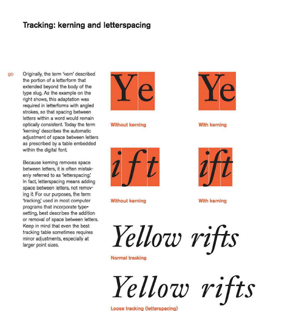
Fig. 5.4 Tracking: kerning and letterspacing
I read these pages so that I can review them back when I was doing this task. I get to recall some of the materials that I forget when I was watching Mr. Vinod's lecture video, so this page of the book helped me a lot.
Fig. 5.4 Tracking: kerning and letterspacing
I read these pages so that I can review them back when I was doing this task. I get to recall some of the materials that I forget when I was watching Mr. Vinod's lecture video, so this page of the book helped me a lot.


Comments
Post a Comment