Typography / Task 3B: Type Design and Communication
27/10/2021 - 17/11/2021 (Week 10 - Week 13)
Reagan Val Adelbert Mahadi / 0349177
Typography / Bachelor of Design in Creative Media
Task 3B / Type Design and Communication
LECTURES
All lectures from week 1-5 can be found here: Typography / Task 1: Exercises (reaganmahadi.blogspot.com)
Week 10
During week 10, Mr. Vinod explained to us about our next task for project 3. He explained the steps that we need to do and also showed us the MIB to guide us for this task. After Mr. Vinod explained the task, he then showed us stickers that the seniors made so that we can get an idea of what our task is going to be.
Week 11
On week 11, Mr. Vinod asked us to show our sketches for the stickers and gave feedback about it. After getting feedback from Mr. Vinod
Week 12
Week 12 is another consultation week where we submit our current progress to Facebook so that we get feedback from Mr. Vinod.
INSTRUCTIONS
Task 3B: Type Design & Communication
For this task, we are required to create a sticker based on an event. I picked the new year's event for my sticker on week 10. For our task, we will be using a 512px width and height artboard at 72 dpi. We have to include Taylor's logo in our sticker and only use the 10 type families that are given by Mr. Vinod at the start of this module. We are also required to make a black and white version of the sticker and when it is approved we can proceed to add colors to the sticker. For this task, we can use minor graphical elements or visuals.

Fig. 1.1 "Happy New Year" in different type families

Fig. 1.2 "Happy New Year" in italic/oblique
For the fonts, I might want to use ITC Garamond Std, Janson Text LT Std, or Adobe Caslon Pro.
Visual Research
 Fig. 2.1 Stickers from Keep Nature Wild

Fig. 2.2 Birthday stickers from VectorStock

Fig. 2.3 Golden birthday stickers collection from Freepik

Fig. 3.1 Sticker sketches (02/11/2021)
I decided to pick on sketch 3 for the digitization and added some graphical elements within the typographical form.
Digitization
 Fig. 3.2 Digitization progress (09/11/2021)
I added small graphical elements like fireworks on the left, a party hat on the letter e, a confetti horn, and confetti above the letter y. For the confetti, I used the tilde symbol (~) for the confetti. For the party hat and the horn, I used the greater/less than symbol and the bracket symbol to create it. For the fireworks on the left, I used the pen tool to create the lines and curved them a little to resemble the firework explosion.
Next, I uploaded my sticker to Telegram by following the steps from the MIB.

Fig. 3.3 Uploading my black and white sticker (09/11/2021)
I provided a short name for my sticker which is NewYearFest, and here's the sticker link: https://t.me/addstickers/NewYearFest
On week 12, Mr. Vinod gave feedback regarding my black and white sticker. So I made some changes to my stickers.

Fig. 3.5 Sticker remake (16/11/2021)
I changed the whole font to Futura Std Book. I tried to cover up the white
spaces by tilting them and adjusting the placing of each alphabet. I removed the
line that represents the fireworks while adding a party hat at the letter p from
"Happy". I decided to add something else to my sticker since it looks a bit more
empty in it so I added some confetti.

Fig. 3.6 Sticker remake progress (16/11/2021)
Now I add the colors to my sticker and the background to my sticker
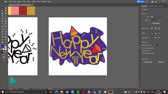
Fig. 3.7 Sticker coloring (16/11/2021)
I used the yellow color and gold color for my font, orange and red for the confetti and the horn, and used the purple color for the background since they are complementary to each other.
I added the stickers into Telegram, link: https://t.me/addstickers/NwYrStckrs
Animation
I proceed to After Effect for the animation part.

Fig. 3.8 Animation process (17/11/2021)
I made an animation for the confetti coming from above to below of the sticker and animated the confetti from the letter y and the confetti horn. I then exported the file using Media Encoder and produced the GIF

Fig. 3.9 Exporting GIF in Media Encoder (17/11/2021)
Final Task 3B: Type Design and Communication


FEEDBACK
Week 11
General Feedback: Review the briefing again so that the direction is always clear. Try to maximize the space of the artboard.
Specific Feedback: It's a bit difficult for Mr. Vinod to comment on my sketch since it is too simplistic. He says he needs to see it clearer. In terms of idea, it is acceptable but he recommends I embed the graphical element within the typographical form. He says that I need to work a bit faster.
Week 12
General Feedback: Use white borders for the background of the sticker.
Specific Feedback: Mr. Vinod said that the composition is fine. I have to tighten up the spacing so that there's less amount of white space for example by using the bolder typeface and alternatively using sans serif.
REFLECTIONS
Experience
This task was quite challenging for me. It took me a lot of time to come up with the sticker idea and I was quite struggling for a while. The process of making the GIF was pretty frustrating as I'm still learning the After Effect software so I had to look up some videos on youtube to do it.
Observations
I see that the use of After Effect wouldn't be that confusing as I was following the tutorials from a youtube video, they were confusing at first but once you get a grasp on it, it's pretty straightforward.
Findings
I find that After Effects can be very useful in making animations as it has user-friendly features that people can use pretty straightforward. I also just knew that we can use the Media Encoder to export lots of different kinds of files.
FURTHER READING

Reagan Val Adelbert Mahadi / 0349177
Typography / Bachelor of Design in Creative Media
Task 3B / Type Design and Communication
LECTURES
All lectures from week 1-5 can be found here: Typography / Task 1: Exercises (reaganmahadi.blogspot.com)
Week 10
During week 10, Mr. Vinod explained to us about our next task for project 3. He explained the steps that we need to do and also showed us the MIB to guide us for this task. After Mr. Vinod explained the task, he then showed us stickers that the seniors made so that we can get an idea of what our task is going to be.
Week 11
On week 11, Mr. Vinod asked us to show our sketches for the stickers and gave feedback about it. After getting feedback from Mr. Vinod
Week 12
Week 12 is another consultation week where we submit our current progress to Facebook so that we get feedback from Mr. Vinod.
INSTRUCTIONS
Task 3B: Type Design & Communication
For this task, we are required to create a sticker based on an event. I picked the new year's event for my sticker on week 10. For our task, we will be using a 512px width and height artboard at 72 dpi. We have to include Taylor's logo in our sticker and only use the 10 type families that are given by Mr. Vinod at the start of this module. We are also required to make a black and white version of the sticker and when it is approved we can proceed to add colors to the sticker. For this task, we can use minor graphical elements or visuals.
Fig. 1.1 "Happy New Year" in different type families
Fig. 1.2 "Happy New Year" in italic/oblique
For the fonts, I might want to use ITC Garamond Std, Janson Text LT Std, or Adobe Caslon Pro.
Fig. 2.2 Birthday stickers from VectorStock
Fig. 2.3 Golden birthday stickers collection from Freepik
Sketches
Fig. 3.1 Sticker sketches (02/11/2021)
I decided to pick on sketch 3 for the digitization and added some graphical elements within the typographical form.
Digitization
I added small graphical elements like fireworks on the left, a party hat on the letter e, a confetti horn, and confetti above the letter y. For the confetti, I used the tilde symbol (~) for the confetti. For the party hat and the horn, I used the greater/less than symbol and the bracket symbol to create it. For the fireworks on the left, I used the pen tool to create the lines and curved them a little to resemble the firework explosion.
Next, I uploaded my sticker to Telegram by following the steps from the MIB.
Fig. 3.3 Uploading my black and white sticker (09/11/2021)
I provided a short name for my sticker which is NewYearFest, and here's the sticker link: https://t.me/addstickers/NewYearFest

On week 12, Mr. Vinod gave feedback regarding my black and white sticker. So I made some changes to my stickers.
Fig. 3.5 Sticker remake (16/11/2021)
Fig. 3.6 Sticker remake progress (16/11/2021)
Now I add the colors to my sticker and the background to my sticker
Fig. 3.7 Sticker coloring (16/11/2021)
I used the yellow color and gold color for my font, orange and red for the confetti and the horn, and used the purple color for the background since they are complementary to each other.
I added the stickers into Telegram, link: https://t.me/addstickers/NwYrStckrs
Animation
I proceed to After Effect for the animation part.
Fig. 3.8 Animation process (17/11/2021)
I made an animation for the confetti coming from above to below of the sticker and animated the confetti from the letter y and the confetti horn. I then exported the file using Media Encoder and produced the GIF
Fig. 3.9 Exporting GIF in Media Encoder (17/11/2021)
Final Task 3B: Type Design and Communication
Fig. 4.1 Final Task 3B: Type Design and Communication B&W - PNG
(16/11/2021)
Fig. 4.2 Final Task 3B: Type Design and Communication Colored - PNG
(16/11/2021)
Fig. 4.3 Final Task 3B: Type Design and Communication B&W - PDF
(16/11/2021)
Fig. 4.4 Final Task 3B: Type Design and Communication Colored - PDF (16/11/2021)

Fig. 4.5 Final Task 3B: Type Design and Communication - GIF (17/11/2021)
Fig. 4.4 Final Task 3B: Type Design and Communication Colored - PDF (16/11/2021)
Link for sticker download: https://t.me/addstickers/NwYrStckrs
Fig. 4.5 Final Task 3B: Type Design and Communication - GIF (17/11/2021)
FEEDBACK
Week 11
General Feedback: Review the briefing again so that the direction is always clear. Try to maximize the space of the artboard.
Specific Feedback: It's a bit difficult for Mr. Vinod to comment on my sketch since it is too simplistic. He says he needs to see it clearer. In terms of idea, it is acceptable but he recommends I embed the graphical element within the typographical form. He says that I need to work a bit faster.
Week 12
General Feedback: Use white borders for the background of the sticker.
Specific Feedback: Mr. Vinod said that the composition is fine. I have to tighten up the spacing so that there's less amount of white space for example by using the bolder typeface and alternatively using sans serif.
REFLECTIONS
Experience
This task was quite challenging for me. It took me a lot of time to come up with the sticker idea and I was quite struggling for a while. The process of making the GIF was pretty frustrating as I'm still learning the After Effect software so I had to look up some videos on youtube to do it.
Observations
I see that the use of After Effect wouldn't be that confusing as I was following the tutorials from a youtube video, they were confusing at first but once you get a grasp on it, it's pretty straightforward.
Findings
I find that After Effects can be very useful in making animations as it has user-friendly features that people can use pretty straightforward. I also just knew that we can use the Media Encoder to export lots of different kinds of files.
FURTHER READING
Fig. 5.1 A type primer by John Kane
I read a topic about type and color in this book.

Fig. 5.2 Type and color

Fig. 5.3 Hue, saturation, and temperature in typography

Fig. 5.4 Contrast in typography
Fig. 5.2 Type and color
I also learned about the importance of hue, saturation, and temperature
in typography which I never knew about.
Fig. 5.3 Hue, saturation, and temperature in typography
To top it off, there's also a topic that I read about the contrast
in typography.
Fig. 5.4 Contrast in typography
Comments
Post a Comment